

Red’s Honky Tonk: Interactive Digital Experience
Art Director: Abby Guido
Red’s Honky Tonk is my Senior Thesis project. I wanted to create a project that combines a physical space with digital elements. The goal was to create a unique experience with in a space and after a summer trip to Nashville for my 21st birthday, I was inspired to create a digital experience for a Honky Tonk. One of my main focuses was making sure that technology implemented into the space didn’t take away from personal connections or socializing. This was a very fun and different project for me and it taught me to break out of the normal pattern and system of UX/UI and take a different approach.

Why A Honky Tonk?
I chose to create an experience for a honky tonk style bar, because I think they have a unique atmosphere, are liked by a wide variety of audiences, and have many opportunities for growth. I have visited Nashville, Tennessee twice in the last year and one of the most famous streets in Nashville is Broadway, which is widely known for its huge variety of Honky Tonks that line both sides of the street. I was a huge fan of the atmosphere these Honky Tonks created and was inspired to learn more about them and develop a digital experience for one.
While visiting I learned a lot about what makes a Honky Tonk experience different from other bars. Some stand-out differences are that they always have live music, they don’t have a cover charge, but tips to the band are recommended, and they have good drinks and good food. I didn’t want to limit my knowledge to just my experience in Nashville, so I did a lot of research on the history of honky tonks and their traditional aspects for them all over the US.
My Approach
I originally began to approach this project the same way I always approach UX/UI projects, with card sorting, user journeys, and site maps, but with advice from my professor Abby Guido, I decided to do something less structured and redundant. Instead of focusing solely on the screens, I decided to focus on how I would present these digital experiences in the physical space of a Honky Tonk.
Ideation
I figured since I wasn’t creating each complete User flow for each interface, I could think big about all of the crazy possibilities that would be in a digital Honky Tonk experience. My first idea revolved around mechanical bull riding because it is among one of the many traditions in some modern honky tonks. With some help from my professor and classmates, I developed about six more ideas for possible digital attractions in the Honky Tonk. I chose to design the most important aspect of each experience and then design an infographic for how each of them would work and look in a physical space.
I wanted to experiment with different types of interfaces in the Honky Tonk and how an experience that already exists can be enhanced. However, I wanted to ensure that any digital experience didn’t take away from the experience, but improved it.
User Personas
I developed three user personas. Each persona is at a different stage in their life and are each looking for something different from a night out. I wanted to have a diverse range of personas to show how an interactive honky tonk can be enjoyed by a wide range of people all over the US.
Branding
Developing the brand for Red’s Honky Tonk was a challenge. The idea is a unique combination of southern/western US traditional aesthetic and modern technology. There is a fine line between the two. I didn’t want it to be too cheesy or generic western aesthetic, but still wanted it to be hinted at throughout the brand.
Name ideation
In an attempt to combine the western aesthetic and modern technology aspects of my idea, I started thinking of names like “Cowboy Connection” and “Rusty Screen”. The more I thought about it and received feedback from critique, I decided to go with a more general, abstract name. I settled on Red’s Honky Tonk because it was simple and easy to say, but it also had a personal connection to me. I have always wanted to name something Red’s because it was a nickname I have been given a few times in my life as a redhead.
Logo
Red’s Honky Tonk logo was inspired by old neon signs that are typically outside of honky tonks and that I saw a lot of lining the streets in Nashville. I added a shooting star for the apostrophe to add a unique element and hint on the night life aspect of Red’s. I also hinted at the technology aspect of the honky tonk by turning the end of the “R” into an upside down wifi signal symbol. The wifi symbol being upside down elaborates on the unique digital experiences that Red’s has to offer.
These are some of my beginning logo iterations. I explored different typefaces and type layout, as well as different apostrophe styles and the addition of an adjective to Red’s name.
After these iterations, I landed on this logo for Red’s. I have a version (on the left) that I use for the sign of Red’s Honky Tonk and the branding throughout, as well as, another version (on the right) for the top of the different interfaces that changes based on how it is being used.

How It Works
Each digital experience at Red’s Honky Tonk is a unique attraction designed to make a honky tonk bar a more interactive experience. There are three floors to the Honky Tonk with a different experience on each. I designed multiple infographics that highlight each experience Red’s has to offer. These experiences can be accessed in Red’s Honky Tonk, as well as on Red’s Honk Tonk app.


An infographic explaining the function of Red’s Juke Box. 


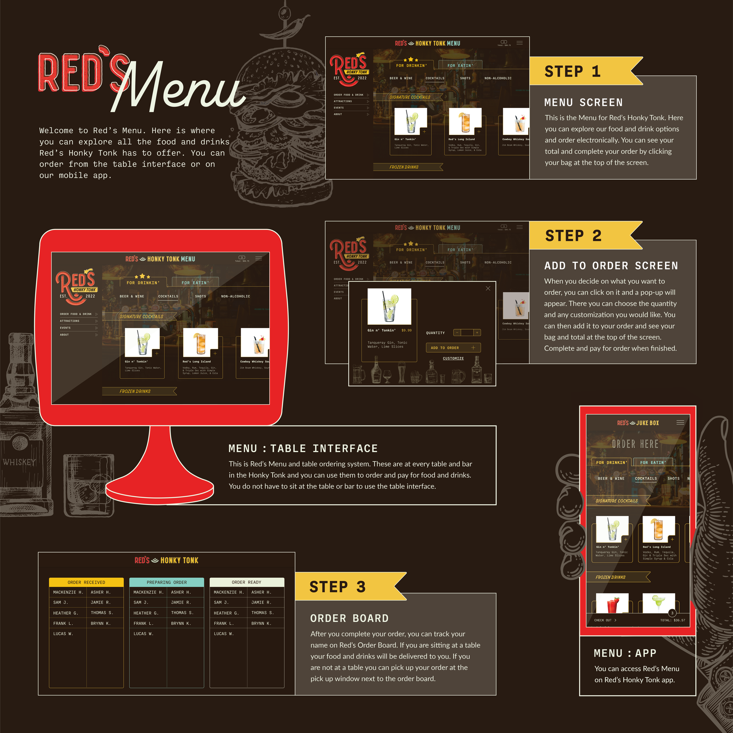
An infographic explaining the function of Red’s Menu table interface and ordering system. 


An infographic explaining the function of Red’s Photobooth and AR filters. 


Conclusion
I really enjoyed this unique approach to designing a digital experience, which helped me break out of the traditional pattern and system of UX/UI. This was a very fun and different project that allowed me to be very creative and create something different from my other work. I hope this gets people interested in experiencing a Honky Tonk themselves.