

MOIRA: A new way to travel & connect
Instructor: Abby Guido
UX/UI Designers:
Aulona Noka
Kaitlyn Gross (me)
Traveling can be challenging and overwhelming. In order to reduce stress and keep the joy in traveling, we created Moira. Moira is a hotel interface that has a corresponding app, which helps you find great places and activities in the area you are staying. It also allows you to connect with others staying in the hotel and see all the unique destinations and activities they are doing during their stay.
This was a collaborative project with another classmate. We are both very passionate about traveling and were eager to challenge ourselves in designing a digital experience beyond a phone or computer.

The Creators
Moira was created by student designers Kaitlyn and Aulona. We both have an interest in the travel industry and were inspired by our own traveling experiences to make Moira.

Research
Formative Research
We started by researching the main issues travelers face when traveling to a new destination. We found that one of the biggest factors is how time-consuming planning can be. With the pandemic, traveling has become difficult and uncertain, which also creates hesitancy and fear in many travelers. In response, travel agents/advisors are more sought after. Travelers often have trouble navigating finding the places they want to visit in other countries and do not want to appear like a lost tourist to locals. Additionally, it could be hard to connect to the locals due to cultural differences and customs.
Secondary Research
We then analyzed more about the future of the traveling industry and found an increase of technology use. A lot of travelers use technology and app services for convenience and efficiency while traveling. Due to the pandemic, many hotels faced a drastic decrease in visitors, therefore the main concern for hotels is focusing on ways for the rooms to be improved for more users to have an enhanced experience, but not much focus on helping the tourists find ways to get around.
Primary Research
To get even more information about the people around us, we created a short survey to see how people experience travel. Many people had different opinions, but there was an overarching theme of making sure to visit all of the places they’ve planned in a short amount of time and navigating to them in a timely manner. We also concluded that many people use hotel rooms for their stays and primarily only use it for sleeping and relaxing.
The Problem
When guests travel to new locations they are often unfamiliar with the best things to do and the best places to eat. Many hotels do not provide a way for people to understand the local areas they are visiting, so they spend too much time planning and researching and not enough time exploring. There is also a tendency when you aren’t familiar with an area to only go to the touristy parts or to places with mainstream names that you recognize. Exploring a new place can be challenging and you might get too caught up in navigating that you miss amazing sights around you.
Ideation
With this research, we started brainstorming ideas that would help solve the problems we found. We initially had the idea of an app that pins different locations in the place you are traveling based on preferences (the pins and reviews show the number of people who have visited and whether they enjoyed it or not). It would categorize based on if it is popular or who liked it — tourists or locals. Then we progressed to having a primarily route app that tracks where you walked that day so you can look back and find the nice cafe that you passed. It would have a collective map of all the routes you took in the city so you can see where you need to explore more. We also had an idea that is larger than just an app, but a digital interface in a hotel or AirBnB room that has recommended points of interest, tips, and restaurants for the specific location you’re staying.

Solution
After all our research and our ideation process, we landed on the idea of a smart mirror in each hotel room that has recommended points of interest, places nearby, and restaurants for the specific location you’re staying. It will include a “Hotel Hub” for residents to post what they did that day and connect with other residents through similar interests. It will also include a relaxing debrief where the guests can see all the photos they took that day and the places they visited. They can easily post these photos on the “Hotel Hub” or create a postcard to send to friends and family. The smart mirror will connect through bluetooth to an app on their phone that will allow people to save places they want to visit while in the hotel room, but be able to access them on their hope when they are out. They can also save specific locations on their phone that they find throughout their day’s outing. The app will provide easy navigation for direct messaging, routing, and a handy itinerary based on saved locations.
User Personas
With the research conducted, we decided our users would be between the age of 25 and 55. We concluded that the user would have to have a disposable income that would allow them to travel and stay at more expensive hotels, as well as, be familiar with modern technology to use the interface and app. The user personas also helped us visualize what the problems were and how we can achieve the user’s goal through our app and interface


Branding
Name Generation
When brainstorming, we were thinking of travel and hotel terminology and words that represent relaxation. We know that we wanted the name to have a sophisticated feel to it. We also knew that we wanted it to be a single word, preferably short that was easy to say and remember. We landed on “Moira” which means destiny. This can be interpreted in many ways, but our main goal was to choose something unique that represents our sophisticated yet fun travel brand in a simple but effective way.

Logo
For the style of our logo, we took a lot of inspiration from simple, monoline logos, and postal stamps. We wanted to steer away from traditional airplanes and globe motifs for traveling thus deciding to go with a bird as our main visual. It represents freedom, flight, and connectivity, all of which we want to show with this brand! Keeping our name in mind, we thought a bird visual connected perfectly.
We each did many logo sketches and shared them with each other. While sketching I was thinking about how I could draw the bird in a unique way and possibly add an additional element to it. My thoughts were maybe I could make it look similar to a plane, or the letter “M” because of the name, or a postage stamp. These are the sketches I did and the sketch all the way at the bottom is the first iteration of our final logo.

Style Tile
Throughout the branding process, we wanted to keep a calm and sophisticated look, however, we still wanted the brand to have a slightly playful and approachable look. We decided on warm and inviting colors and used them based on the light and dark mode that the hotel interface will have. We were aiming to have fun aspects as well, which is notable in our stamp illustrations and unique icons. Keeping our initial brand guidelines in mind, we also chose typography that was both sophisticated and easy to read!
Moira’s Style Tile UX Process
User Flow & Journey Map
Using the information we collected from our research and survey we began to create journey map and user flow for each specific user persona we generated. The journey map helped us understand how each persona would use our interface and how they would feel using it. This influenced our user flows to make the personas planning process as streamlined and intuitive as possible to avoid any stress and confusion.
One of our user persona's journey map and user flow. The general goal for each user flow was for the users to be able to search Moiras interface to find places and activities they wanted to save. Each persona has different interests and saved places based on what they wanted to do. The user flows also showed how the personas used their saved places on their phone and how they used the interface when they got back to their hotel room. Working on the user flows and journey maps simultaneously allowed us to revise our problems thus impacting our UX design. For example in the beginning we noticed there were too many buttons for the user to go from one page to another, so we minimized the number of clicks as much as possible.
Site Map
With all of the information and research, we were ready to brainstorm the elements that would be incorporated into our prototype. Throughout the planning process we heavily relied on working with Miro which is an easy and collaborative tool. With the site map, we were able to visually understand where the user is finding each page and section. For example, for our app we really focused on the remote screen and for the interface we focused on the Today’s Travels section as those were the most important features of both. Our main goal was to make everything easy to navigate!


How it works & Our goals
The hotel interface includes the connectivity aspects like the “Hotel Hub”, Local culture, Restaurants and Today’s Travels. All of these features will be easily accessible and laid out on a main menu page so the user can choose where they would like to navigate first. For the interface we focused on the Todays Travels, specifically the photos aspect, since a majority of our users use hotels for relaxing and winding down.
The Moira app also includes the same aspects as the interface with an additional section being the bluetooth remote. This has a microphone as well as keyboard so that the user can easily navigate the interface without having to stand at their mirror and scrolling on the screen. Since both are being used simultaneously we also incorporated tips for users to use the app for an easier experience.
Wireframe
The low-fidelity wireframes are a full draft of what screens we would need for the user to complete tasks and how they would be layed out. We got feedback from our professor and classmates about what other screens we might need and how the screen could be tweaked.
Once solidifying our low-fidelity wireframes, we started working on our high-fidelity wireframes. This process consisted of implementing our branding into the layouts of the low-fidelity wireframes.
A few wireframes we created for Moira’s hotel interface and app. 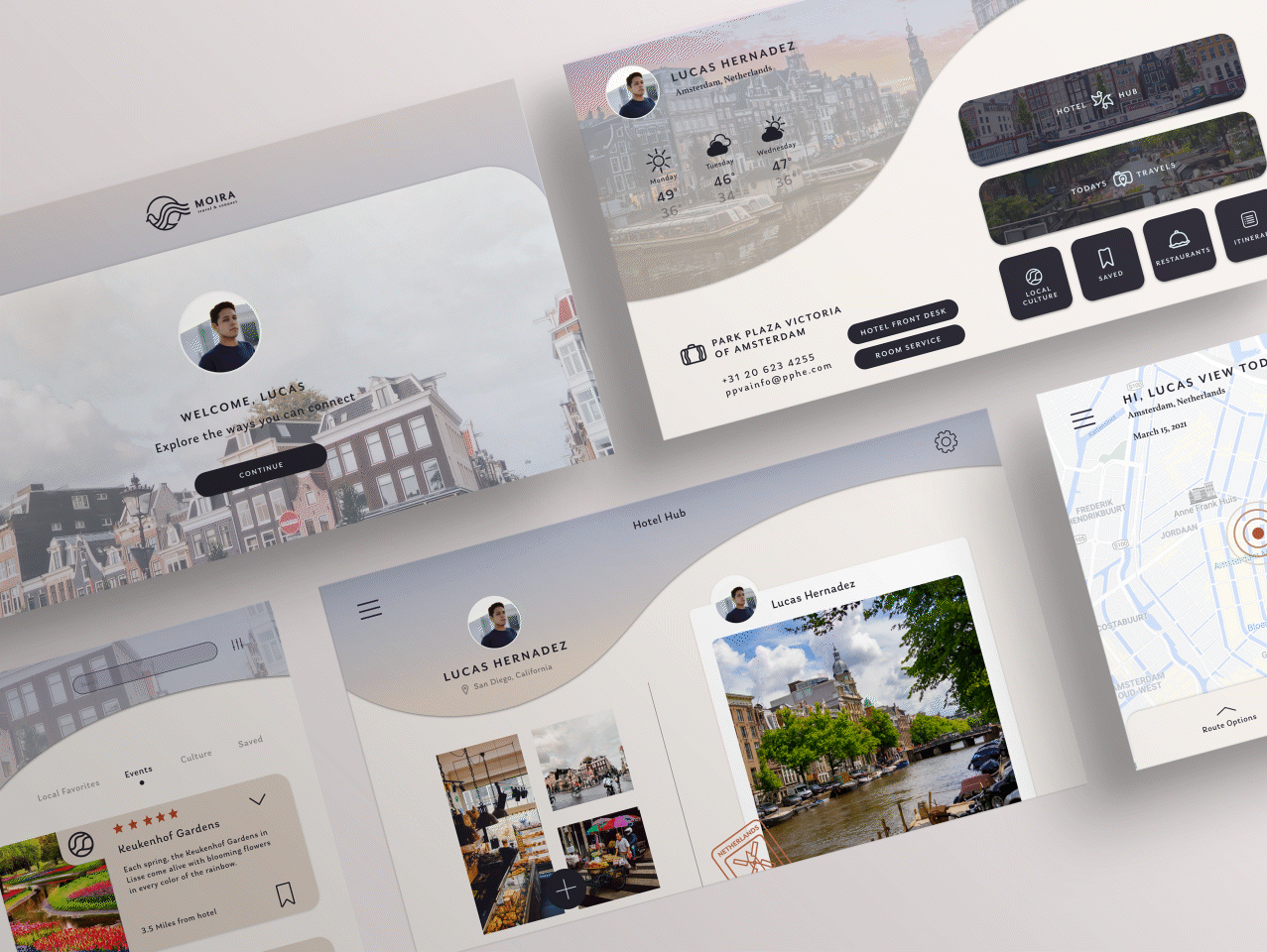
Day to night mode gif
Interface Design
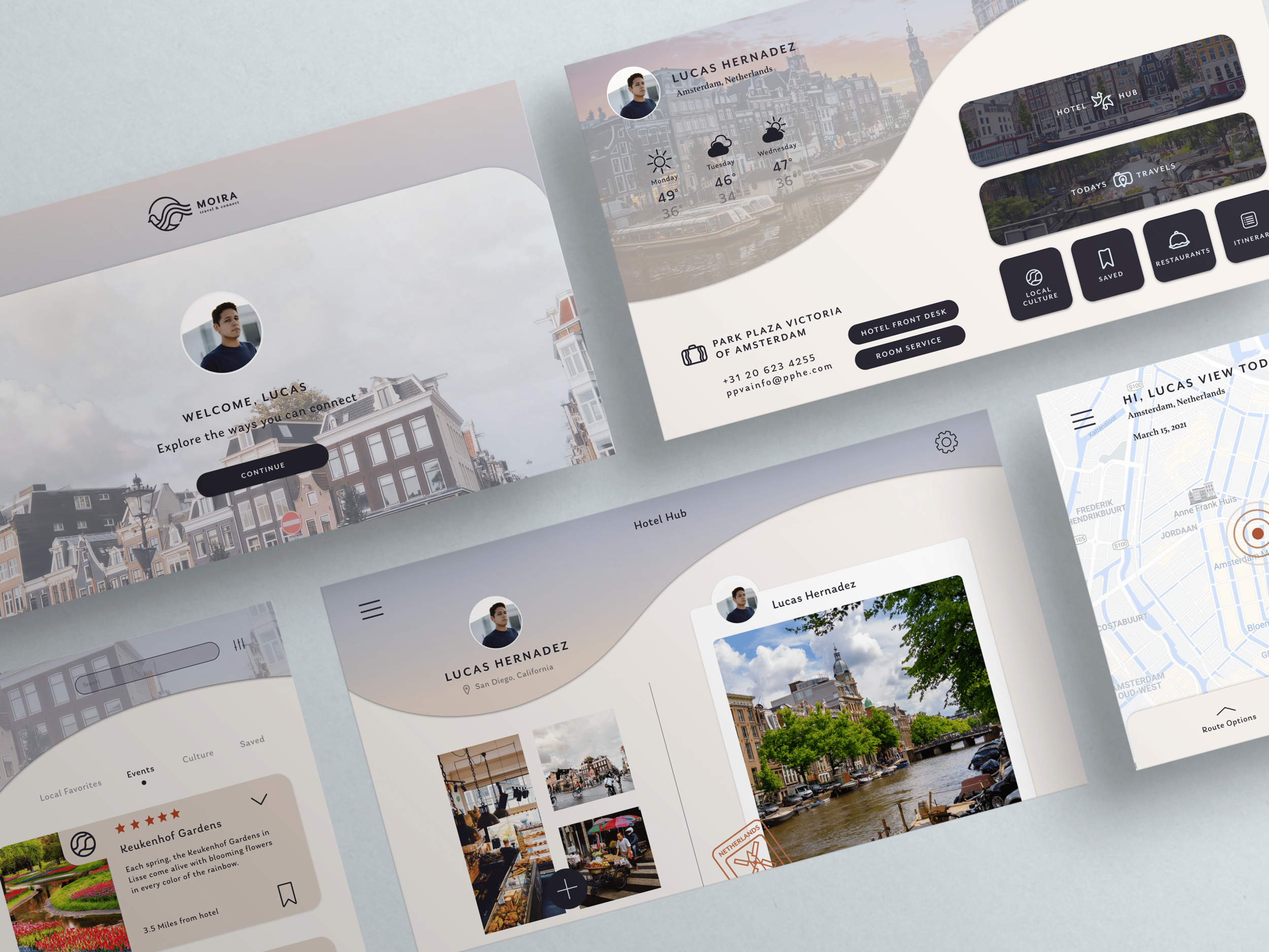
Hotel Smart Mirror
The smart mirror interface was heavily influenced by our research, particularly our surveys. We wanted to focus on the easy access of local places near the hotel and ways to connect with other travelers. To do this we made sure the interface was intuitive for any user to find what they are looking for, connect with other travelers with similar interests and a place to look back on the memories made in a new country.
We implemented a day mode and night mode design for users to see the screens clearly based on lighting. Based on our surveys, most travelers use the hotel during the night time so our main priority is creating screens for the night mode. We included slideshows, gallery views, and sleep mode for users to see the places they visited that day and giving the option of posting onto the hotel hub for others to see!
App
We wanted to create a corresponding Moira app that can connect to the mirror via bluetooth when desired. The purpose of the app is to be able to access Moira’s resources and your saved places when on the go. On the app you can also access a remote that allows you to control the hotel interface from your bed.
The app flow starts with entering your reservation number and name, so that Moira can customize your experience based on location. You can then create an account, so that all of your information and places of interest are saved. After that, the user is free to navigate the app as they wish.

Our interface welcomes the user to main menu where they have access to all of the features of Moira. The “Hotel Hub” is where the user finds other travelers in the hotel and can connect to them through messaging. Todays Travels shows the photos and routes the user had taken that day. Local Cultures and Restaurants is where the user can access unique things to do in the area or recommended restaurants near by. Saved and Itinerary is where users find the locations they saved for later and want to visit and their organized itinerary of those saved places for the length of their stay.

One of the main purposes of the app, is the remote. The remote connects to the Hotel interface and allows users to control it from their bed, instead of standing at the touch screen mirror all night. Users can access the interface menu on the remote and click through options with the arrows. Users can also navigate the interface using voice commands.

Conclusion
Throughout the process of our project, as a team and individually, we learned many new things and faced some challenges when designing for this new type of interface. Our major challenge was figuring out the best way to design the remote on your phone to be used on the Moira smart mirror. Making sure it works easily and efficiently was very difficult to tackle for us. With the help of our professor and classmates, we were able to overcome this difficulty. We also struggled with designing for a larger interface and making sure the text and buttons fill the space wisely without being too big or too small. We also faced some challenges in the collaboration aspect of this project. It was difficult finding time to meet together, taking more time to reach agreements and/or a compromise on some aspects of the design, and making sure each of us were happy with the direction it was going. Overall, it was a great experience for both of us to create a new and innovative service for an industry we were passionate about and to learn how to collaborate with another designer.