

Neighborhood of Manayunk: Civic Tech Rebrand
Instructor: Sara Hall (Director of UX with the City of Philadelphia)
Designers:
Brett Sweeny
Kaitlyn Gross (Me)
This is a project from my UX and Civic Tech class, where we were tasked with creating branding and resources for a neighborhood in Philadelphia. I collaborated with a classmate on this project and we explored the neighborhood of Manayunk. This required us to design for audiences with varying ability levels, ranges of digital access, diverse demographics, and different cultures. While doing this we were able to explore the benefits, constraints, and opportunities that exist in designing for government.
Our goal was to create an inclusive, accessible design system with accompanying digital assets and an online social media presence for the neighborhood of Manayunk. We needed to gain a deeper understanding and connection between the neighbors of Manayunk and how they can access government tools easier. With more and more aspects of government being transferred into the digital realm, we wanted to tackle how can we establish a digital presence that can be used long after we are finished the project.

The Team
The team consisted of Brett Sweeney, a classmate of mine, Sara Hall, an instructor and Director of UX with the City of Philadelphia, and myself. With our team, we dedicated a lot of time and effort to make the most user-friendly and human-centered design that we could. The entire project was a collaboration, but to highlight each other's strengths, I focused a lot on branding and the visual design of things and Brett had focused a lot on research and some principle UX aspects of this project. We learned a lot from each other and a lot about how collaborating can really impact a project for the better.
Research
To be able to create an inclusive, approachable design with all audiences in mind, our team took a lot of time and effort to research the neighborhood of Manayunk. We wanted to consider the overall feel and unique characteristics of the neighborhood. Since this project highlights accessibility for diverse demographics, we needed to be considerate of all neighbors of Manayunk.
Secondary Research
To help gain a better understanding of the neighborhood we are designing for, Brett and I spent time conducting secondary research and visual research through photography. We asked questions like Who is living there? What gravitates people to Manayunk? How do people access technology and how we can create an accessible web presence to better help the people of Manayunk?
From our research, we found that Manayunk was made up of a combination of singles, young families, and multigenerational residents, which brings a modern contrast to Manayunk's blue-collar origins. Over 300 small businesses are located in Manayunk making it a local hub for creativity and promoting local business and entrepreneurship. Due to the location of Manayunk along the Schuylkill River, it is a perfect spot for recreation like biking, kayaking, fishing, and public art.

Demographic Research
Through our secondary research of the demographics of Manayunk provided by the latest U.S. Census Bureau release, the 2019 American Community Survey, we found out that the total population of Manayunk is 5,547. Split between 54.8% male members of the population and 45.2 % of the population being female. Also, the median age of Manayunk residents is 32 years old.
We found that Manayunk’s population is made up of 67.12 % of non-family households, followed by 32.88 % of family households.
Another demographic that helped us make decisions when designing for Manayunk was the fact that most residents of Manayunk held some sort of White Collar Occupation making up 89.44% of the population. Followed by Blue Collar Occupation making up only 10.56% of the population of Manayunk.
User Personas
Based on our secondary & demographic research, we were able to use the data we gathered to create user personas of the residents of Manayunk. The demographics of the members of Manayunk included members ranging from young professionals to retired adults. Having a diverse set of user personas who rely on government services differently helps us make better design choices for all. During the design process our user personas helped us to visualize what problems we need to solve and the goals we will help our users achieve when accessing government websites.
These three user personas we created were to represent someone who didn’t need Manayunk’s government services, someone who did need them, and someone who needs them for business. The first user persona Emma is a young, single, healthy woman who isn’t in need of Manayunks government services, but enjoys knowing what is going on in her neighborhood. The second user persona Edward is an elderly member of the neighborhood with health issues, difficulty getting around, and struggles with using technology, therefore he would benefit from government services. The third user persona Patricia is a mother, wife, and small business owner and her livelihood is based on Manayunk’s government services in order to run her business.
Branding
When starting to think about branding, we knew that we wanted something that represented Manayunk and its unique characteristics. We started off by brainstorming the logo. We did some logo research and experimented with three different logo directions. The three directions were a bold icon, a typographic badge, and illustrative line work. We individually sketched logo ideas and brought them together to expand on them further for each variation.
Once the first drafts were done, we narrowed down our ideas and developed the drafts of the bold option and the linework option into more finalized vector logos. We ended up going in the bold icon direction for the logo because we felt that it was the most responsive and successful for Manayunk's digital presence. Its simplicity and boldness would allow it to be used in multiple sizes and it created a strong symbol for the neighborhood.
After the logo direction was decided, we experimented with different type lock-ups and how they would be used. We created a few iterations, a responsive logo, a full logo with type, and a department logo.

Design System
Once we had the logo established, we started to define our design system. We chose colors that had great accessibility for all users and used them in ways that would be most successful. We decided to use a sans-serif typeface that is easy to read and use at multiple sizes and weights. We combined it with a serif typeface to be used as a subheader. Once those foundations were established we designed buttons for Manayunk’s digital presence and sourced consistent icons. The design system components like card styles and image treatment were established after creating the wireframes.
Manayunk’s Design System Low-fidelity wireframes for Manayunk’s landing page and department pageWireFrames
Once our users were established and our branding was finalized, Brett and I started to develop wireframes for Manayunk’s digital assets. We created low-fidelity wireframes for the landing page of Manayunk’s website for web and mobile, one of Manyunks department’s pages, and a digital form and business owner portal. Our goal was to have a consistent and simple layout in order to have a user-friendly and accessible interface.
Creating wireframes allowed us to visualize the digital assets and think through how they can be used by each unique neighbor of Manayunk. Doing wireframes also allows us to work through any layout issues or usability issues quickly and efficiently.
Low-fidelity wireframes for one of Manayunk’s digital formsInterface Design
Landing Page
On Manyunks landing page, we wanted to make sure all the frequently used resources were easily accessible. We created an icon card system for each resource and have them positioned on the top of the page. We included a news section, so residents can be up to date on local news. We also included a section for residents to report a problem. This gives them a clear and direct place to report things this will hopefully lead to more residents reporting issues. After that, there is an events section that shows the time and date of local events and meetings taking place in the neighborhood. There is a see more button that allows you to view the whole calendar if you are interested in a date that is not shown. There is then a stay connected section where residents can enter their email and sign up for a newsletter to be kept up to date with everything Manayunk. Lastly, there is a social media section where Manayunk-related posts are collected and can be viewed to see what the residents are doing around Manayunk.
Manayunk’s Parks & Recreation
We decided to fully design Manayunk’s Park and Recreation page because of Manayunks great location and young population there are a lot of nature and possible events and activities in the neighborhood. The page starts with common services that are available and then it goes into an about us section that just highlights the city of Manayunk and what the Parks and Recreation Department does. Then there is an event section that highlights the events specific to parks and recreation and a places to visit a section that shows a few local places that are a must see in Manyunk. There is also an activity finder that can generate activities or places to visit based on your interests. Lastly there are additional resources to learn more about what makes Manayunk unique, focusing on its connection to nature and its culture.

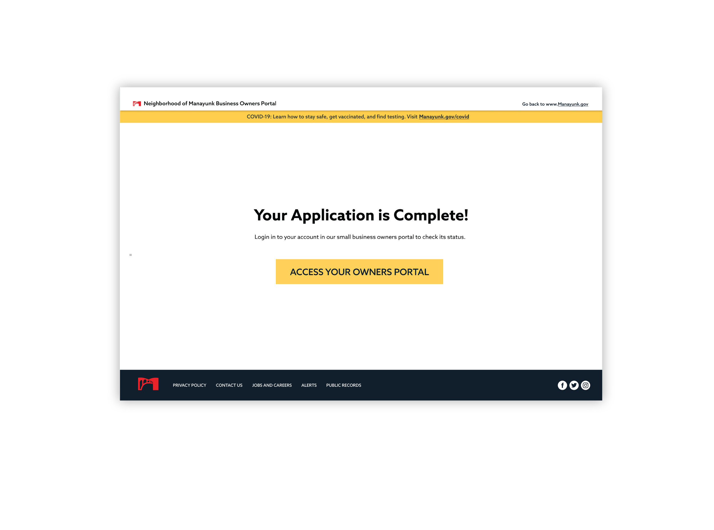
Small Business Owner Portal
Due to Manayunk’s large amount of small businesses, my team and I thought a useful resource for business owners would be a digital portal that allowed them to organize and keep track of forms and applications that they to run their businesses. The portal will allow you to track the status of your form and remind you if any forms need to be updated or resubmitted.
In correlation with the small business owners portal, my team and I created a digital form for an existing paper form. Our goal was to make the form easier and more comprehendible for all people. We focused on recognizable and industry-standard question and answer styles. Using systems that are familiar to some users is one of the best ways to ensure that our form is intuitive to users.


Web and Mobile
Along with designing for the web, my team and I designed a responsive site that can be used on desktop or mobile devices. While making the mobile interface we needed to establish a system for how the same amount of content would be available on a smaller interface. To avoid overwhelming the user with the same amount of visual content, we minimized some of the components and added see more buttons to sections that had more content that wasn’t directly seen.
Brand Extension
Due to Manayunk’s younger population, my team and I wanted to make sure Manayunk had a strong social media presence. We created an Instagram for Manayunk and made three posts advertising for a 5K event. Along with the Instagram, we also branded the 5K event.
Manayunk’s Instagram precense


Conclusion
This was different from other UX projects I had worked on because I didn’t have a choice of who I was designing for. Most of my projects in the past allowed me to create my user or create something for the specific user I wanted, but with this, there is a very diverse and wide range of users that we had to design for. That required us to focus on accessibility and the inclusiveness of the design. This was a more practical design project that allowed me to see another side of UX/UI design.
